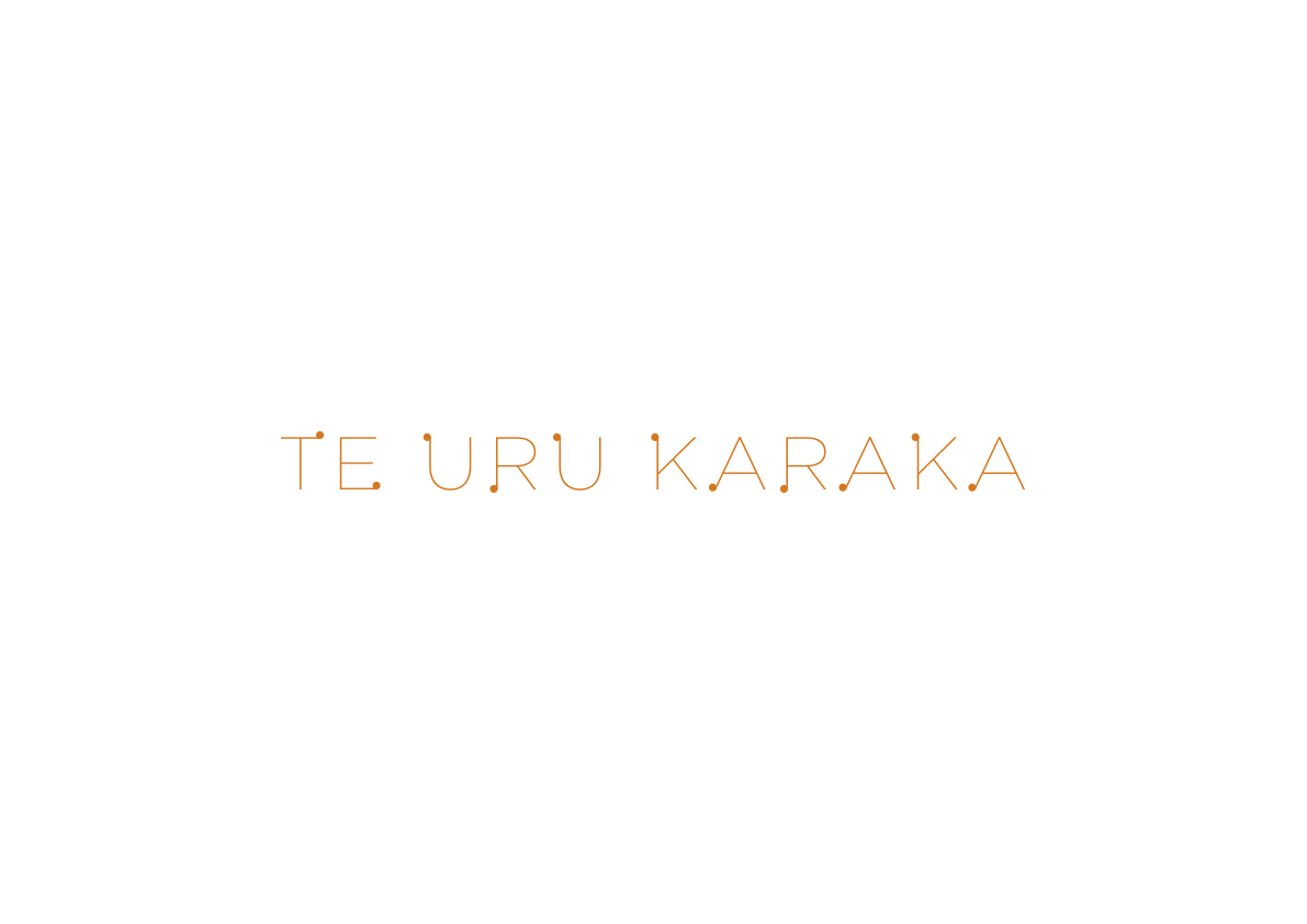
Te Uru Karaka is the name of the Rūmaki (immersion) school within Newton Central Primary School in Grey Lynn, Auckland. With enrollment numbers falling as other primary schools in central Auckland were presenting bi-lingual propositions to their catchment communities, the whānau-led rūmaki unit embarked on a marketing campaign to raise the profile and increase the pipeline of new whānau entering their ‘tono’ process. Newton Central School had a strong history of puna reo excellence so designing a stand-alone identity away from the Newton Central identity needed to demonstrate puna-reo excellence while still remaining in a tuakana-teina relationship with the wider school.
The Karaka tree was an endemic species of tree that grew prolifically in and around this area pre-colonisation where the school is situated today. The Karangahape ridgeline that the school sits upon is steeped in history with the valley below (that the northwestern motorway sits within) the portage between ngā Moana Waitemata and Manukau where Tainui dragged their waka from one harbour to the other. The team at Colour tried to design a brand-lock up that represented new growth, aspiring into light while remaining anchored to a colour palette that represented the Karaka berry why orange featured in the brand and the little berries featured too as a design element in the name.